Examining institutional manipulation through design
A case study in aesthetic confusion
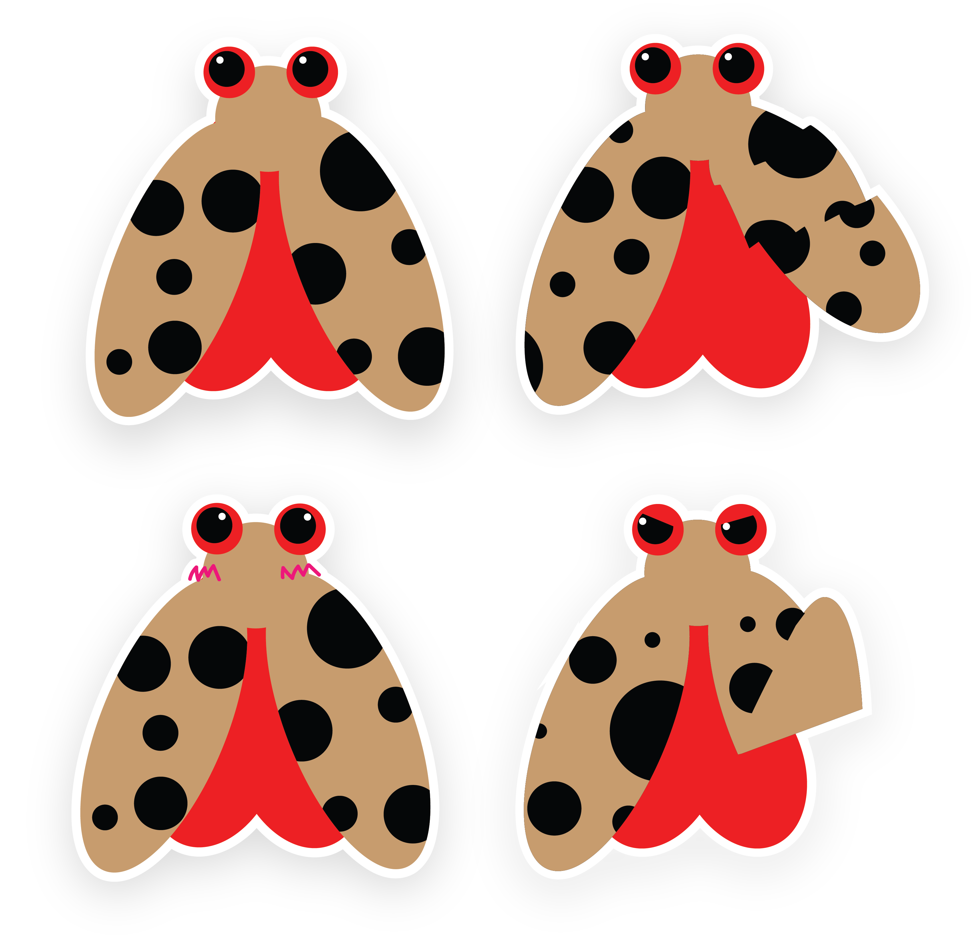
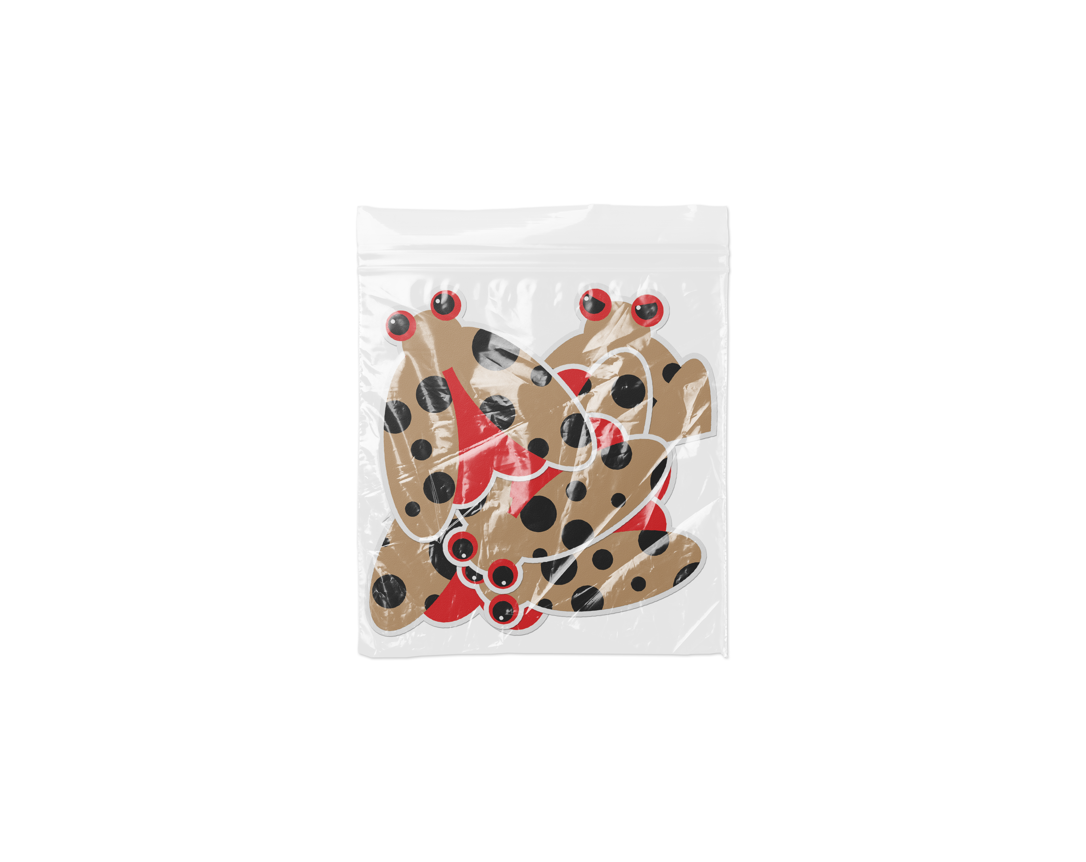
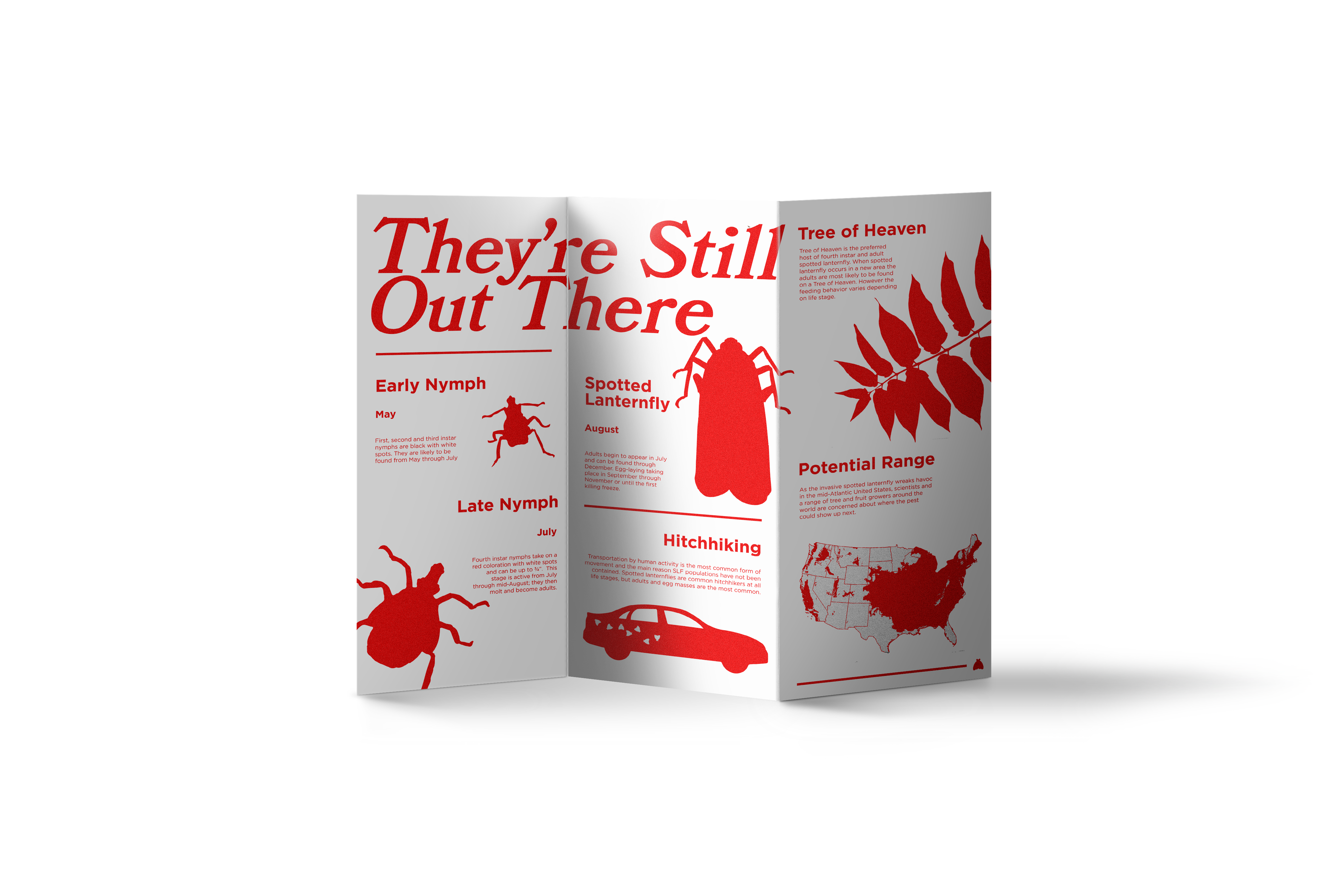
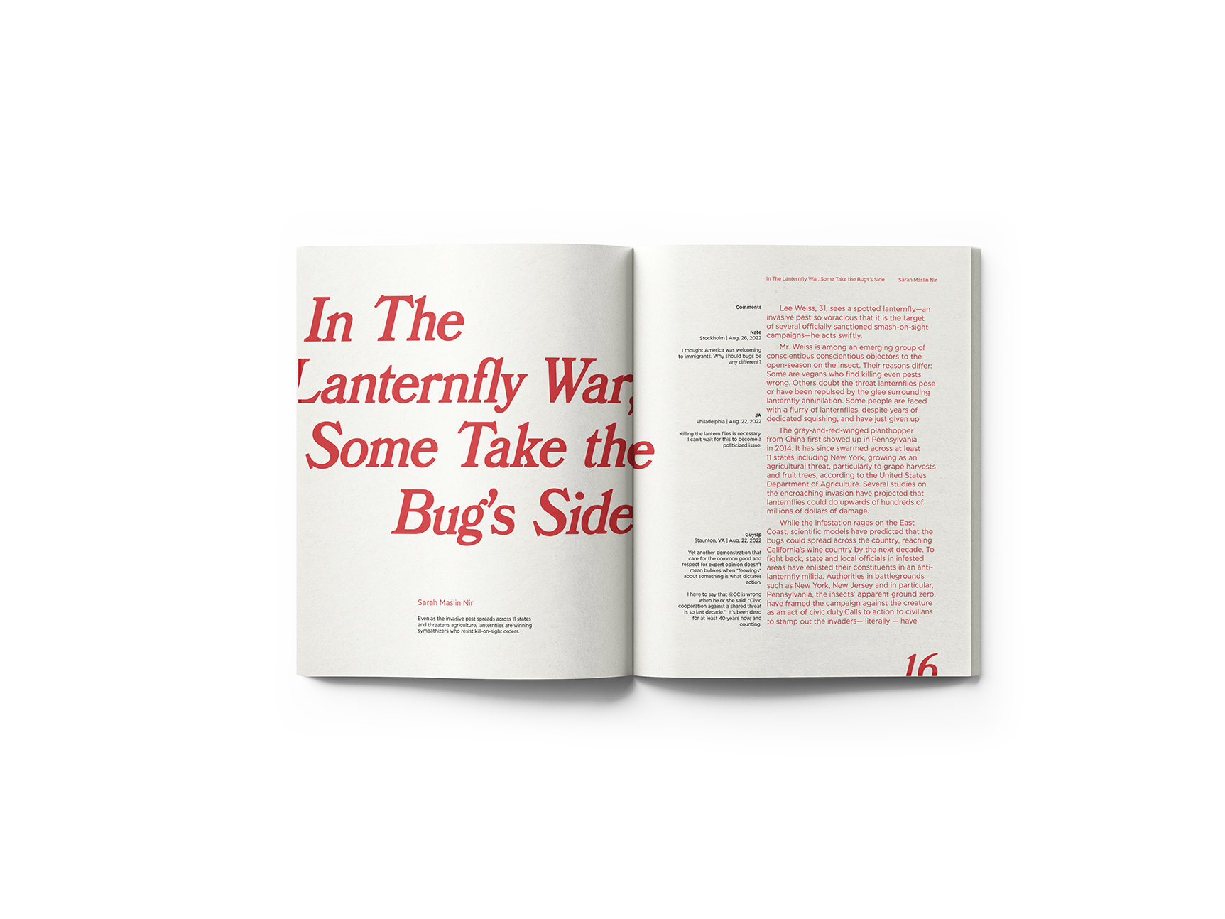
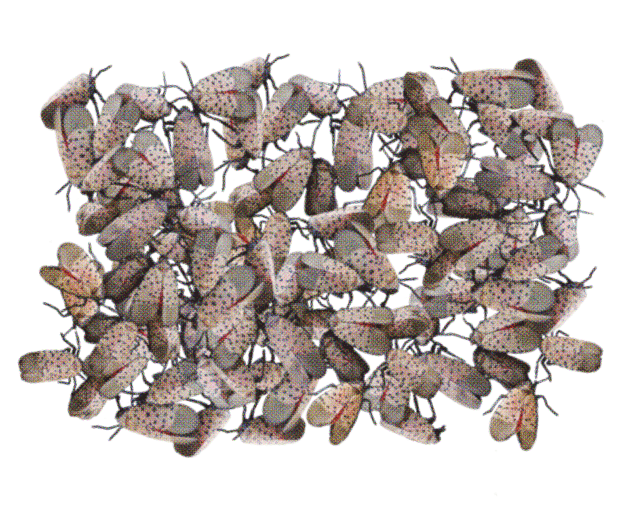
The Lanternfly Project explores how aesthetic confusion can be weaponized in public discourse through an invasive species crisis. The project mirrors corporate tactics of using visual ambiguity to paralyze public action, drawing parallels to how tobacco companies and oil companies have historically muddied urgent issues through sponsored messaging. The Spotted Lanternfly, arriving from Southeast Asia during COVID-19, serves as both metaphor and mascot for examining institutional manipulation and xenophobia.
Display Font - Headlines & Key Messaging
Subheadings & Important Callouts
Gotham - Large Body
20px / Leading statements
Gotham - Regular Body Text
16px / Main content
The interplay between Bookman JF Italic and Gotham creates intentional tension between:
Project
Examining institutional manipulation through design
A case study in aesthetic confusion
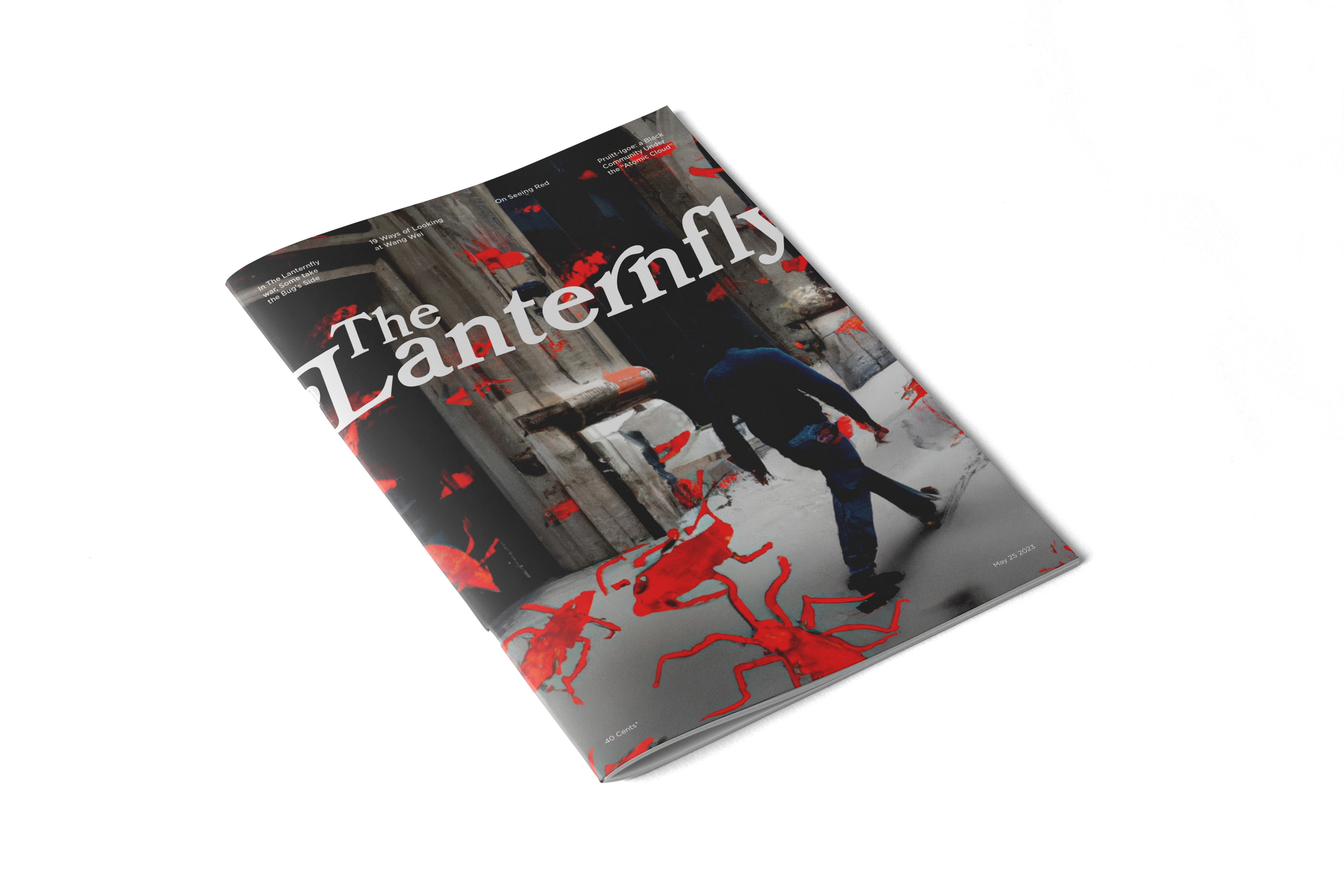
The project's visual language plays with tension: between 'old' and 'new' New York in its typography (Bookman vs. Gotham), between institutional authority and approachability in its mascot, and between beauty and destruction in its subject matter—reflecting complex narratives of invasion, immigration, and public response during crisis.